2/21/2022 - 1970's is in the blood of Bright Noa's design
Heya! Life has been kicking my ass big time and I've had zero energy, so it's why site updates have been so slow. They still might be slow for a bit too. Thanks for the paitence! But I bring a fresh new blog post for you all today!
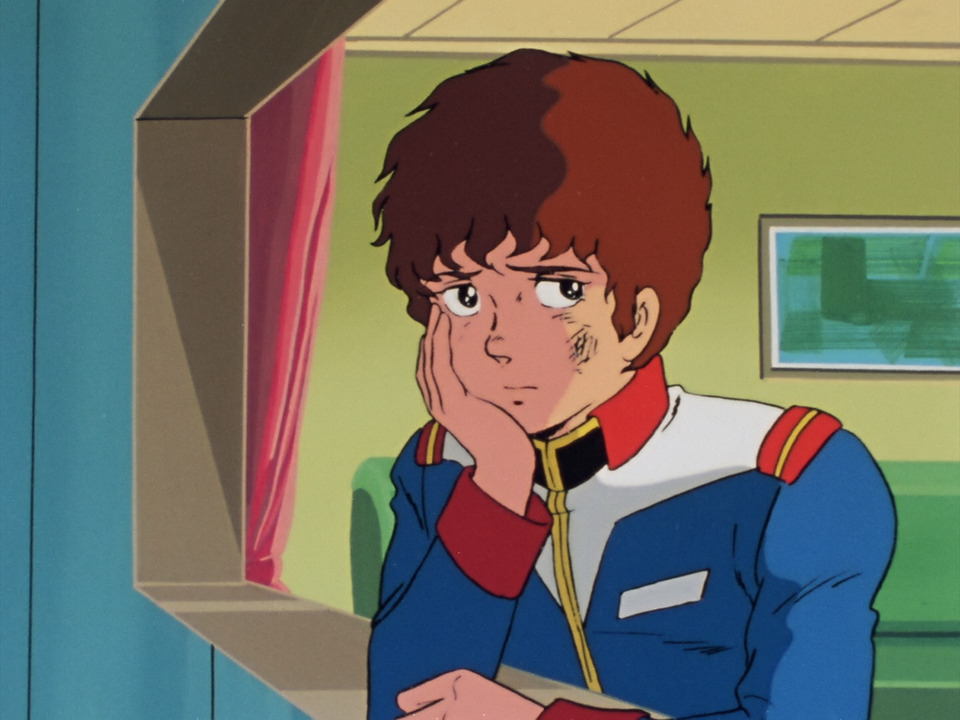
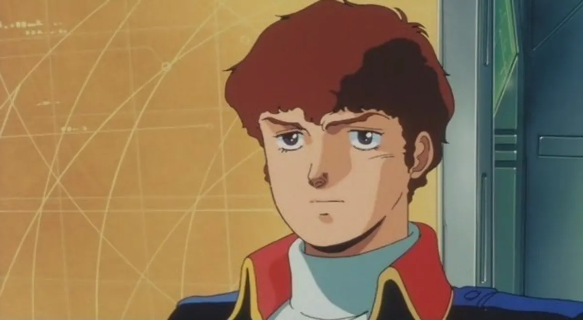
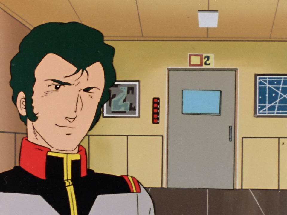
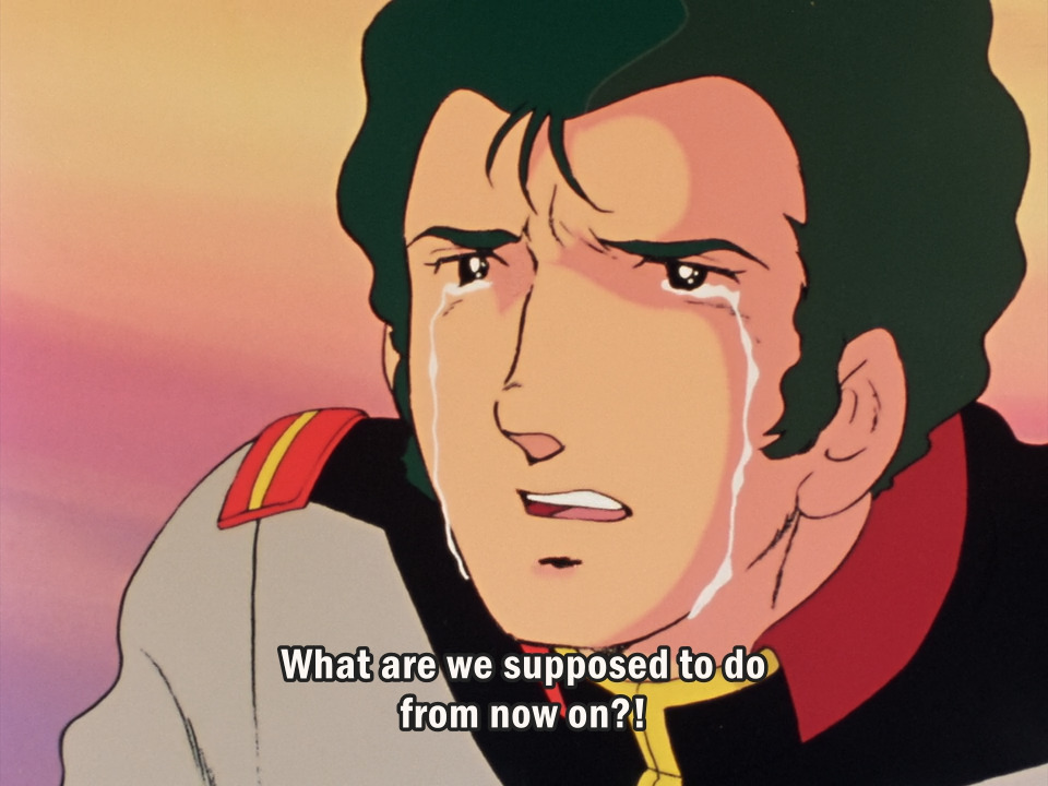
I love Bright Noa. He’s one of, if not, my favorite UC Gundam character. I love his arc in First Gundam as a whole. A 19 year old in the federation's army, suddenly thrusted into a captain's position because he is the only one who is STILL ALIVE that is most qualifed for that role. Now having to command a whole battleship throughout a massive war, as well as watch over and command a bunch of teenagers, who are just not as ready to deal with the horrors of war as him. But alas, they have to, and they all must press on fight on, and survive.
(If you know this scene, I'm not sorry for the emotions I've inflicted on you. I'm still crying myself... T_T)
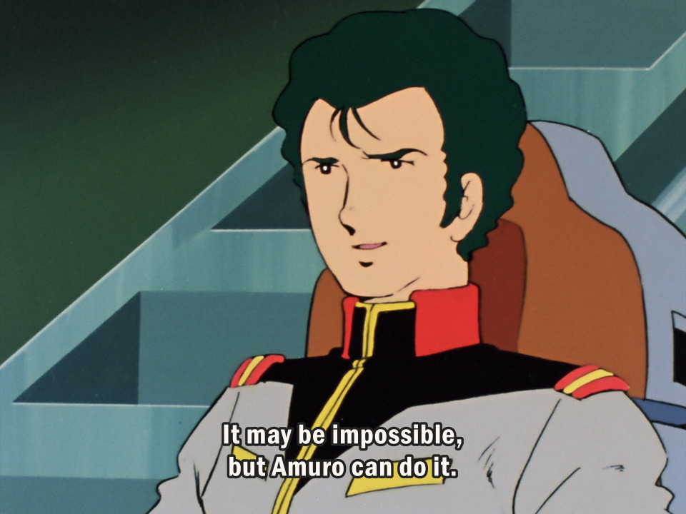
First Gundam is just really damn good and shows the horrors of war. 40+ years later and the story and message of the show is just as, if not more powerful than when it aired in 1979. The writing and characters are just... SO GOOD! Watch Mobile Suit Gundam guys. Seriously. It holds up so well, I Implore you to watch it! And his romance with Mirai is incredibly sweet, I love them so fucking much. I also just want Bright to get a massive vacation because by God, does he need one.
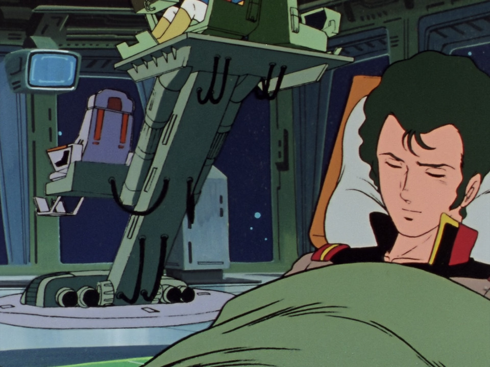
(Shhhh.... he's sleeping, don't wake him up....)
(Note: I have only seen First Gundam in terms of the "main" UC anime. I tried Zeta but I couldn’t get into it, and I don't really have much desire to check out every single Gundam thing ever, I felt a lot of pressure for a while because of it. Maybe one day I'll give Zeta another shot. Also I have no desire to watch the a new translation movies because the switch from old anime footage to the new stuff they made is just too jarring for me.)
I’ve had discussions with friends and some other gundam fans as a whole about Bright. And at least with those I’ve talked about, Bright is at his best looking in First Gundam. He doesn’t really “Look right” in future entries, a sentiment me and others share.
The type of autistic I am has that flavor of autism where I am obsessed with 1970's anime, and could talk about it on great length for hours. I have been deeply in love with that decade of anime since 5th grade. I just really like it.
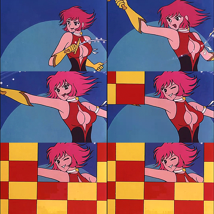
While I love old anime as a whole, the 70's in particular has a very special place in my heart and brain too. There's a lot of reasons, definitely worthy of a future blog post of it's entirety. But one reason is definitely the fact the 1973 Cutie Honey anime was my gateway into the classics, alongside speed racer (which is from 1967 but regardless) and were what began my love for old anime.
Sailor Moon was my first ever anime but by the time I discovered Cutie Honey, which I actually found via a Sailor Moon custom doll blog (the cutie honey flash dolls were very popular as bases for customs! Which makes sense, since both CH Flash and Sailor Stars shared staff, said staff from Sailor Stars sent to work on Flash right after work with Stars was done. So their styles share a lot in common.) I don't think it was exactly classified as "retro" just yet at that time.
I don't choose the special interest,the special interest chooses me.
Anywho, here’s a meta essay nobody (except maybe 3 people) would want to see about Bright Noa, and 1970's anime character design trends. (Also, a part of this I copy pasted from a discord ramble with a friend, but I did fix up things, as well as added new parts to this all, so hopefully this all makes at least some sense and is worded well.)
I've seen a good number of 70s anime, and Bright’s design just has a lot of traits that are a part of that specific time period, which "fell outta style" when it comes to being used when designing characters in anime in the decades following.
Art trends change over time which is ok, but going forward due to bright having many aspects that were part of 70s anime character design and those not being commonplace in the industry anymore, they didn't really get him right because of that in later installments.
So it explains why bright looks incredibly different if you put 0079 bright and CCA Bright (as one example) side by side and they look very different. CCA bright is a good example in general because he has a lot of design trends that were more prominent in the 80s for anime men, which just does not translate well on Bright at all. (At least to me)
It’s also worth mentioning how as Gundam went onwards (and I’m speaking in the “main'' Universal Century stuff here, so 0079🠮Zeta🠮ZZ🠮Char’s Counterattack) the overall style of the and look of Yoshikazu Yasuhiko’s, the character designer, chief animation director, a key animator for Mobile Suit Gundam 1979 anime, art style got more and more phased out with each subsequent entry onwards. Yoshikazu Yasuhiko’s style got phased out and replaced with Hiroyuki Kitazume’s.
(An example with Amuro 0079🠖CCA)
With my research Hiroyuki Kitazume was at first a character designer on Zeta Gundam, as well as an animation director on a selection of episodes. With ZZ Gundam he was then the character designer for that, as well as also being an animation director for some episodes in that as well. And in Char’s counterattack, he was the character designer and animation director for the movie.
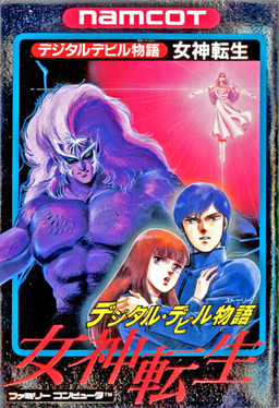
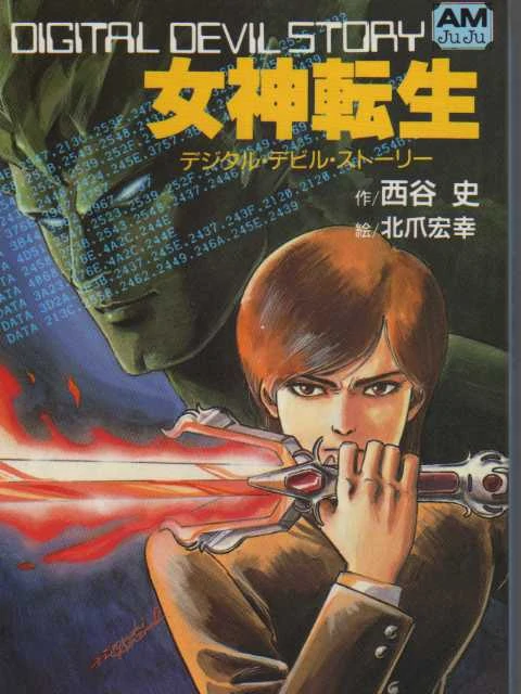
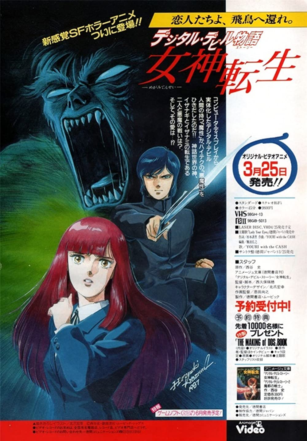
(Fun fact: He did the art for Digital Devil Story: Megami Tensei!)
With Yoshikazu Yasuhiko not working on any Gundam after Zeta (returning to do F91, as well as some other things afterwards) and Hiroyuki Kitazume taking more of an active role, it makes sense how Yoshikazu Yasuhiko’s art style was phased out over entries. However I feel that this does not lend itself well to the design of Bright Noa since the design Yoshikazu Yasuhiko did for him has a lot of character design trends that were prominent in that decade.
A few months ago, I even made a chart to show it!
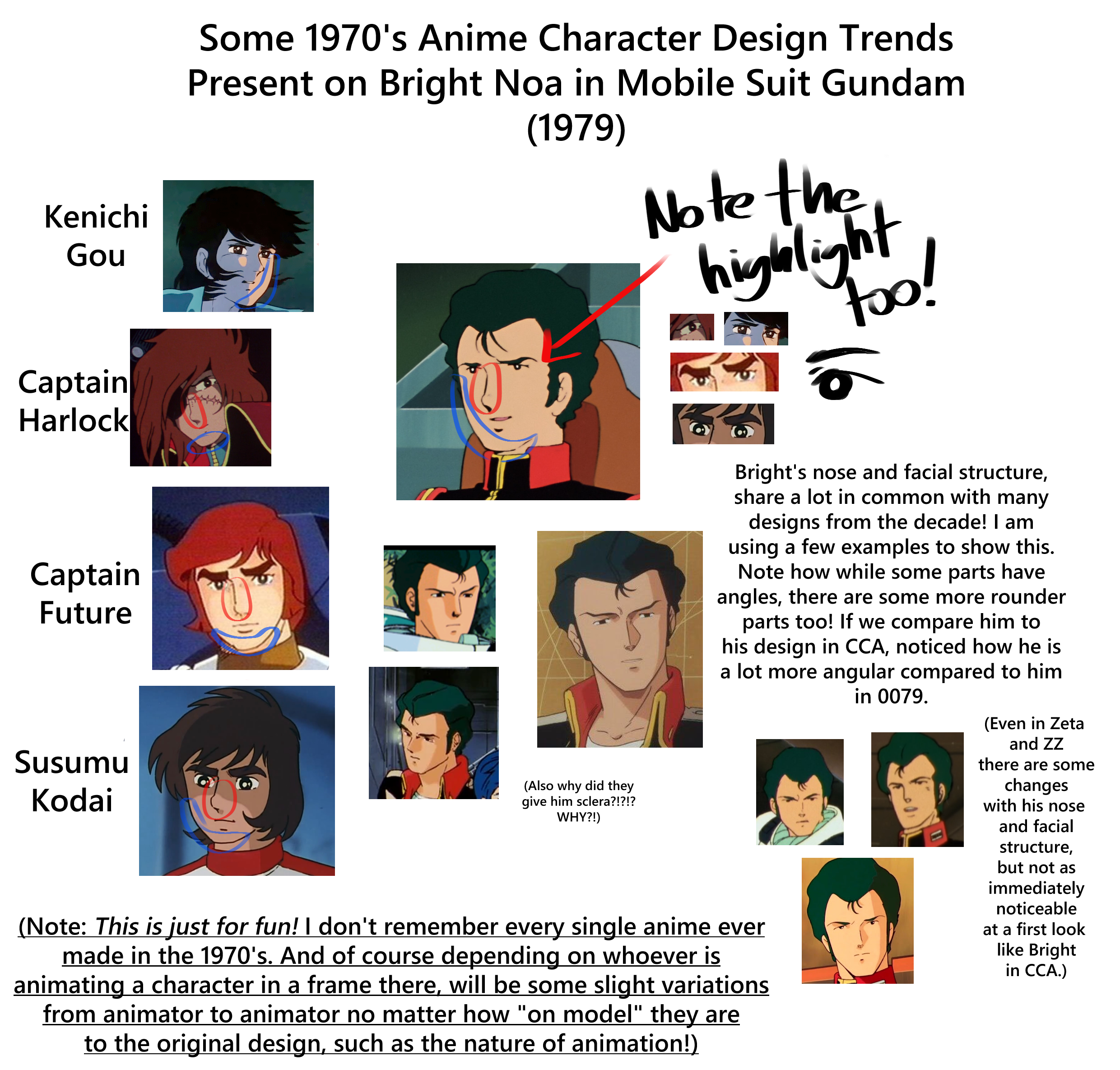
(This is the power of an autistic who just really loves 1970’s anime.)
If you look at the chart, you can see how his design lends a lot to trends from that time. The nose, the facial structure and the eyes, especially the highlights in them too. The character examples used in this graph are only a sampling of some characters from that decade, but were characters who came to mind to me instantly when making this graph.
Also important to note his lack of scalera, while more of just a choice that depends on the style of the artist as well as the type of character in my own personal experience observing older anime, it’s still a very prominent part of his design. It’s a big part of what makes him stand out to me!
Bright sort of just morphs in a way from entry to entry. They sharpen his jawline and facial structure, and sharpen his nose. Bright has a balance of soft with some sharp in certain places, which was just a very common thing in much of 1970’s anime character designs as a whole.
As I said to a friend once: “They tried to make Bright into a bishounen in later entries.”
Bishounen characters in anime and manga, even the earliest credited ones, tend to have sharper features. Sharper noses, eyes, facial structure, etc. Bright is a character that was made with that soft and sharp balance. If you sharpen him, to me, you lose a lot of his essence.
Personally to me Bright is a time capsule of character design trends from the 1970s. With his nose, eyes, facial structure, and that overall sharp and soft balance is what makes Bright, well… Bright, to me personally.
To me, later installments can't really get it “right” because they try to translate design trends from the 80s’ as well as Hiroyuki Kitazume’s style(which also embodies a lot of 1980’s anime for me, well his work from that decade anyways), which just does not work at all for a character design like Bright’s.
(Though I do like how he looks in Gundam Unicorn! Haven’t watched it though.)
_[static.wikia.nocookie.net]_2022-02-20.png)
IMPORTANT FINAL NOTES:
First, I do not by any means hate the art of Hiroyuki Kitazume at all! Far from it. I do adore his work. I am by no means intending of putting his work down, and those who enjoy it. I am talking about my personal taste for a character design. Which is inherently subjective! Art is subjective overall which is what makes it so special. If you like how Bright looks in latter entries, I am legitimately happy you can find something to love and enjoy in something I'm not able to. All of this here is just my own personal thoughts and opinions about the topic.
Second, please let me know (politely) if I somehow got any information here incorrect. I do my best with my research, but I am human after all, so I am prone to error because of that.
Thank you for coming to my Ted Talk, and listening to my ramblings about things pertaining to my special interests. And thank you for your patience as well with my slow speed for site updates. Life has been kicking my ass real bad but I am doing my best to make the most of things as best I can.
Thank you for reading this blog post and witnessing my rambling! Have an awesome day everyone!
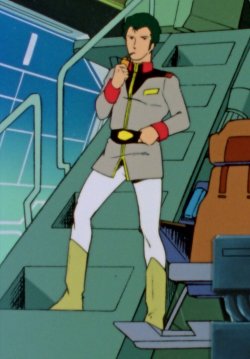
(SUNRISE I BEG YOU, GIVE ME A SLICE OF LIFE WITH HIM AND MIRAI. ITS ALL I NEED.)
You can check out the full list of posts that have been made here.
_[static.wikia.nocookie.net]_2022-02-21.png)
